
Project Lead

User Interviewer

UI/UX Designer

UI/UX Designer

User Interviewer

Founder & CEO Aila Health
We partnered with Aila Health on redesigning their physician and patient platforms. The purpose of these platforms is to allow remote monitoring of patients suffering from chronic illnesses to better understand and diagnose their conditions.
Aila Health is on a mission to bring personalized care to each and every patient. They are using artificial intelligence to empower healthcare providers and patients to make better healthcare decisions. Aila Health helps chronic illness patients manage all of their conditions in one place while simultaneously helping providers maximize reimbursement with their easy-to-use remote patient monitoring platform.
The current state of the physician and patient platforms are not ideal. The physician platform needs an improvement in informational hierarchy and sequestering of patient data. The prior state of the platform was more confusing the use and some lapses in informational logic. The platform is not being extensively used by physicians yet, so provider feedback is also necessary to discover more pain points in the ongoing redesign.

of patients who suffer from persistent illnesses and chronic conditions


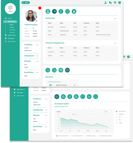
Our solution to the problem: a platform for physicians to removtely monitor chronically ill patients to better understand their unique conditions. We co-designed the platform through the work of an interview team and a wireframing team that maximized potential such that the app could utilize as much physician feedback as possible. It’s intuitive and organized, yet powerful enough to accomplish the needs of the physicians who would be using it.


We wanted to create a wireframe that had Aila’s target demographic in mind: older physicians who wanted something that woudn’t be too complicated but still had functionality.
To accomplish this, we reorganized the original platform to include sections, each with their own individual bubbles for ease fo navigation.
Our app consists of:


In our user interviews of healthcare providers, we gained a better understanding of:
The 5-second rule is crucial — a physician must be able to come to a conclusion when looking at data, tables, or graphs within 5 seconds. Following the 5-second rule, it is critical that designers make simple, comprehensive designs for professionals using the platform that are not technologically experienced.

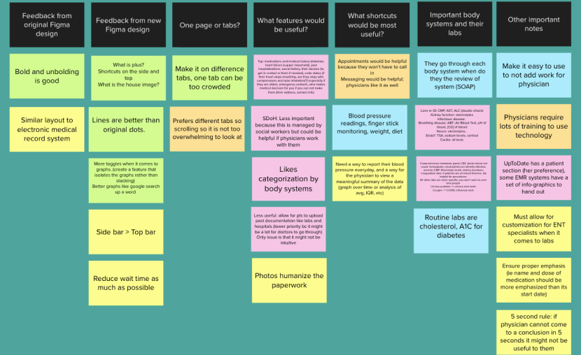
This board of virtual sticky notes is a glimpse into our interview process. There were certain parts of the wireframes we looked to improve upon, so in our virtual interviews we were intentional in asking pointed questions regarding these pain points in the design. The board shows the different responses to these questions
