
Project Lead

Design Consultant

Design Consultant

Design Consultant

Design Consultant

CTO of Concha Labs
Concha Labs’ machine learning methodology carefully curates sentences based on the frequencies of consonants and vowels. It then optimizes your sound profile based on your perception of speech, allowing you to understand every part of every sentence in your conversations. They aim to accomplish this through a web application, which is where we came in.
Concha Labs builds customized hearing aids that cost a fraction of the price of traditional devices. To calibrate the devices, users are taken through a series of hearing tests on a web app. Our team was tasked with redesigning the calibration interface to make it more accessible for people of all ages and abilities.
While Concha’s underlying technology is incredibly powerful, that power means nothing if users are unable to harness it. After performing some preliminary user testing, we found that the interface was poorly designed for people who were older and lacked experience with technology.

who are hard of hearing and are less confident with technology


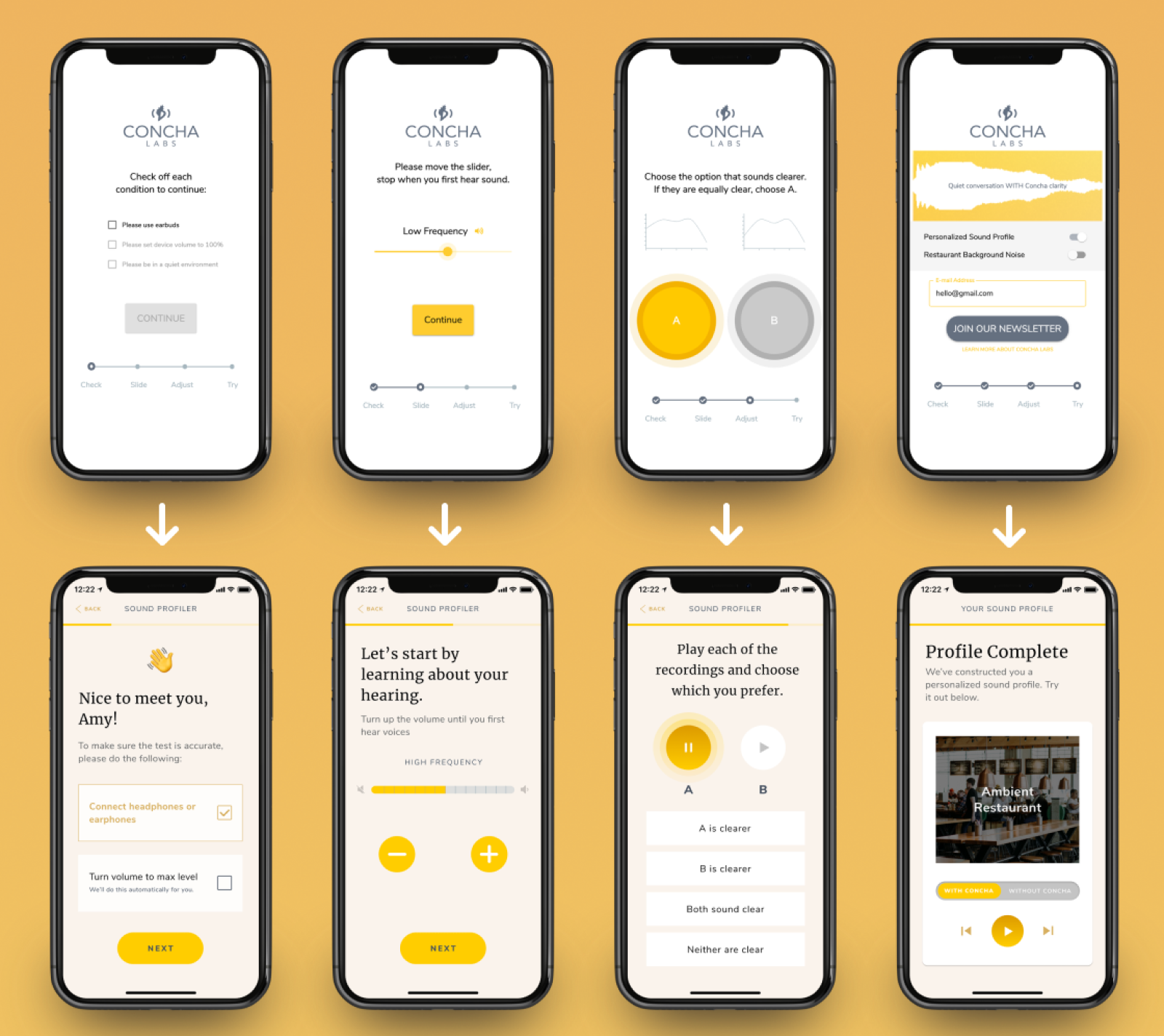
We strove to understand the pain points of an existing fringe user group through research and testing, which drove our design flow of a web application to accompany Concha’s specialized hearing aids. Through intensive usability testing, we utilized user feedback to create an overall more accessible and functional interface that allows users to create a personalized sound profile, specific to their needs.


After performing some preliminary user testing, we found that the interface was poorly designed for people who were older and lacked experience with technology. Some constraints we wanted to keep in mind included:
After identifying specific problems with the UI and researching accessible design principles, we redesigned the interface with the following improvements in mind:


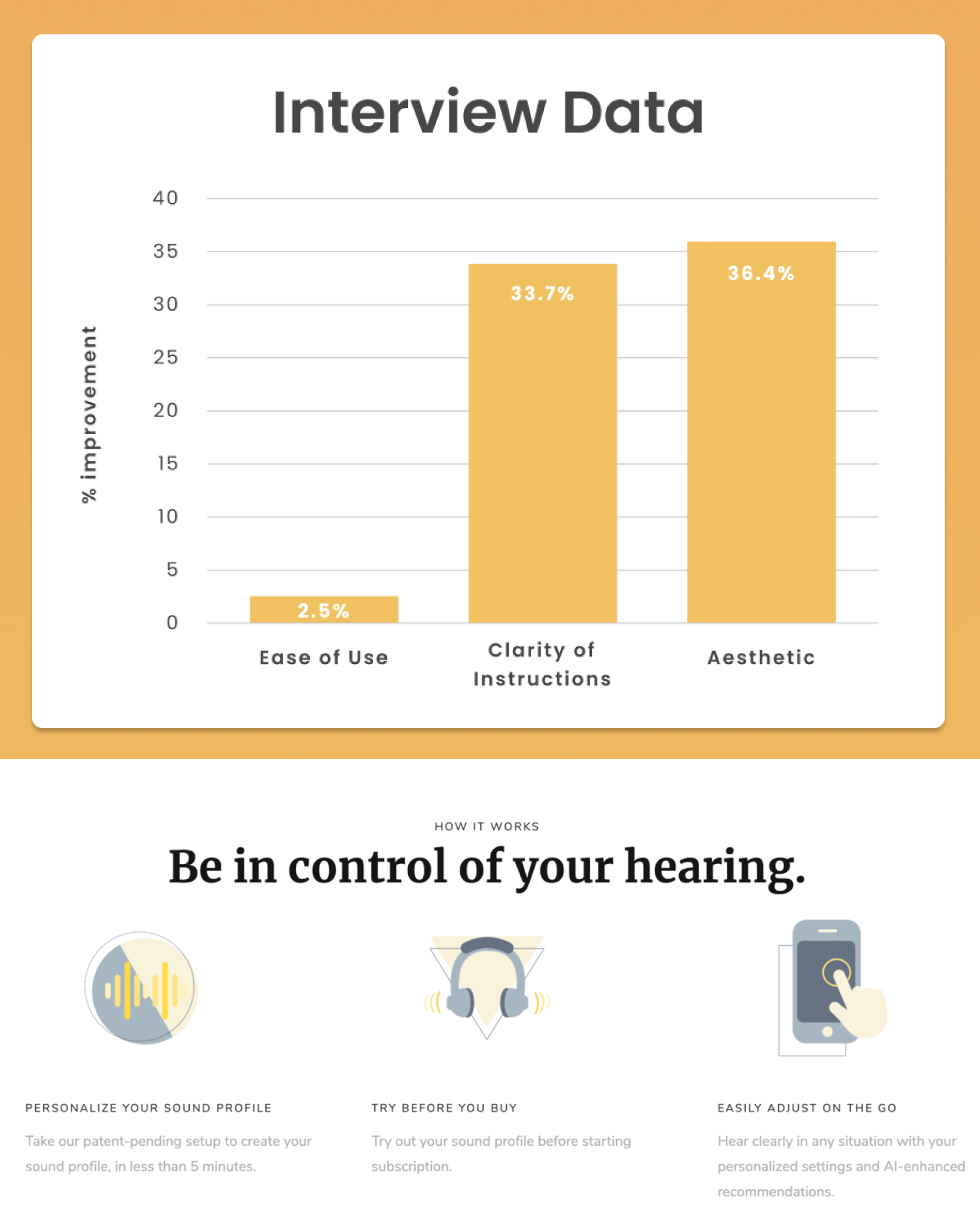
We ran 16 usability tests, taking into account ease of use, clarity of instructions, and the app’s aesthetic. Users were asked to score each metric on a scale of 1-10. While the data above shows aggregate scores across the entire app, certain screens had greater improvements than others.
Specifically, we found that some users struggled to use the slider altogether. Our redesign to use buttons with discrete marks instead were a clear improvement, as users spent less time worrying about finding the “correct” spot, while also giving them more confidence in their results.
Concha Labs has begun implementing some of the preliminary changes we’ve suggested, which should increase conversions and make users happier.
