
Research + Design Lead

Technical Lead

Web Development

Research + Content

Design + Development

Research

Program Manager for the Director’s Office

Marketing Communications Manager
Our team, dedicated to Hans Hofmann and BAMPFA’s mission of inspiring young artists and the community, sought to expand art experiences to cater to as many individuals as possible. Using technology and community-guided research, we created an innovative web application to accompany the Hans Hofmann exhibit.
"BAMPFA inspires the imagination, ignites critical dialogue, and activates community engagement through art, film, and other forms of creative expression.” (BAMPFA Website). Stephanie and Rachael who work in Marketing and Program Management at BAMPFA resepctively both care about expanding the museum experience to cater to diverse audiences. Along the way, they connected us to exhibit curator and leading Hofmann expert, Lucinda Barnes.
Coming along as a silent partner in our process was Hans Hofmann himself. A patron of the arts and education, Hans actually taught at UC Berkeley back in the 1930’s. He inspired his students to embrace the arts no matter their background and to reach into their communities to lift others up. He cared about the community and actually donated the money for the creation of BAMPFA itself.
Museums have gained the reputation of belonging to the rich or exceptionally-educated. This narrative is perpetuated by the intimidating nature of large, primarily silent spaces, with long blocks of fancy wall text. While all these factors in and of themselves are not elitist and were likely created to help people engage with the material, the resulting circumstances locks certain people out of the art experience.

who feel left out of or excluded from the museum-going experience


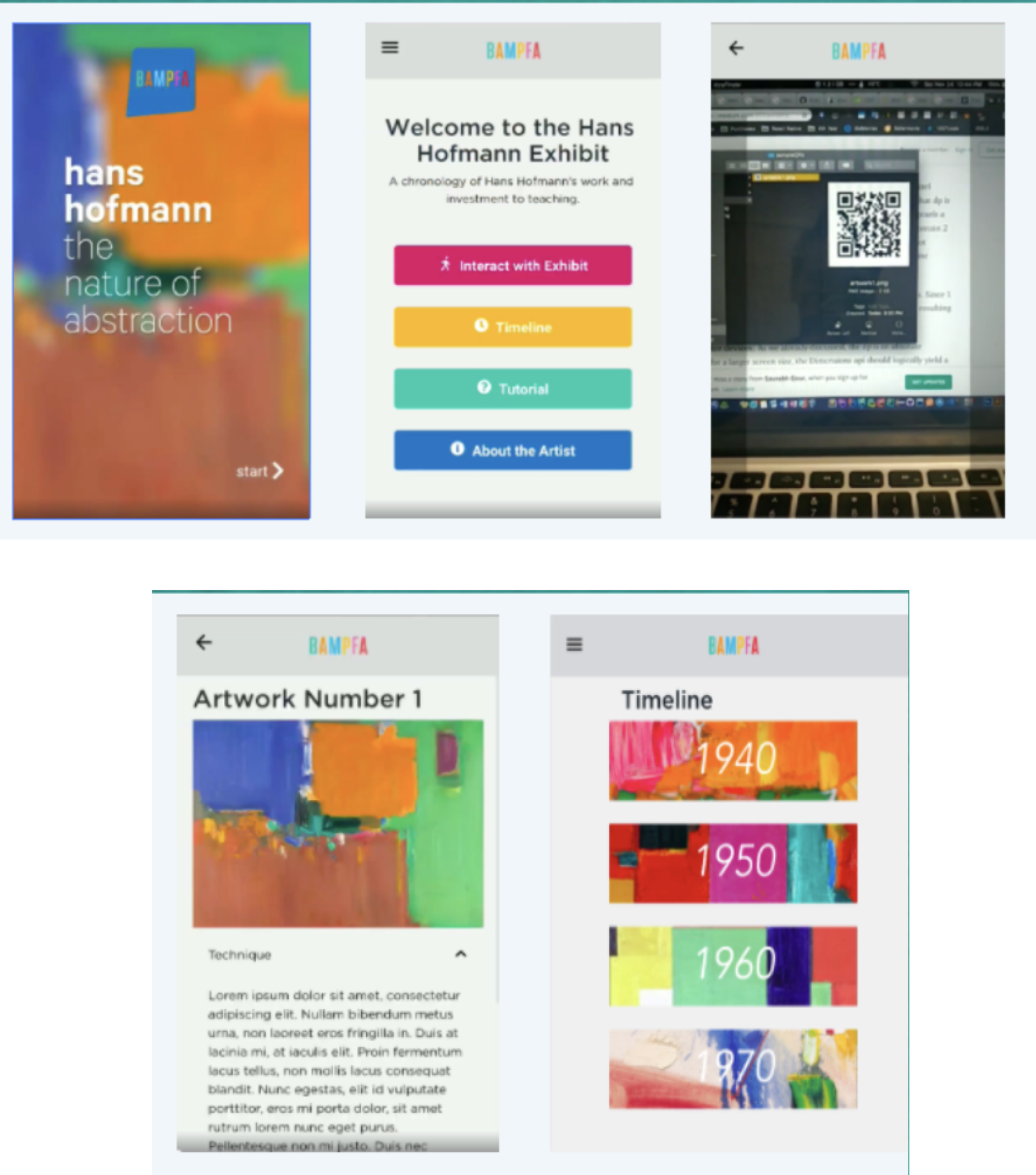
Our solution combines inutition and ease into an accompanying web application that guides users through the exhibit and provides customizable, enriching content to enhance the museum-going experience. See the finished product here.


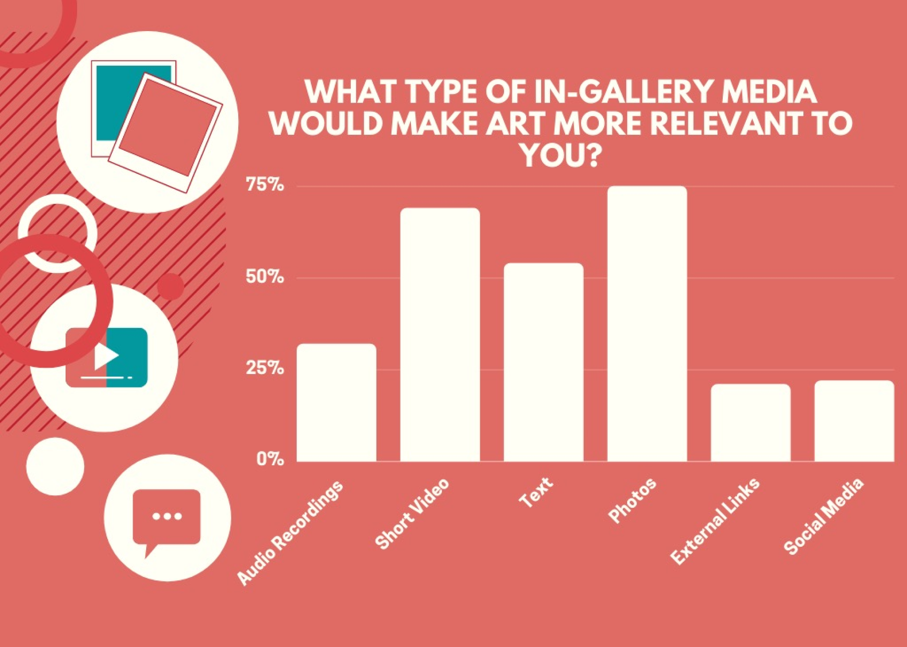
We decided to survey museum patrons to get a feel for their perceptions and preferences. Interviewing many people allowed us to create the best product for our users that wouldn’t take away from the experience.
To avoid overwhelming responders , we pared down our queries to just five main questions and interviewed anyone and everyone who came through the main lobby for three weeks.
We found that:


We began by close reading the curator’s essay and drafting questions we had about the material and Hofmann.
Next, Lucinda graciously agreed to let us interview her. We met in the gallery, recorded her responses and learned extensively about Hofmann.
We put the interview reponses together into short videos and decided to subtitle the videos in English (as a start).
We also found impactful quotes from the essay about various pieces in the exhibit and recorded our own voices. We decided to use our own voices as we are a group of diverse, young individuals hopefully keeping up to our promise of creating non-intimidating content.


At first, we diverged by creating many wireframes and ideas to find a good flow for the application.
Next, we converged on a single design and each broke up to design and code various pieces of the application: the land page, the timeline, the image database etc.
Each painting in the exhibit had accompanying information ranging from image recreations, basic painting details, video or audio files, and photos from Hofmann’s life that patrons could access on the app through a QR code which we got the museum and curator to agree to (not an easy feat).
Finally, to assess or work, we looked at web analytics to see how many people used our application and for how long.

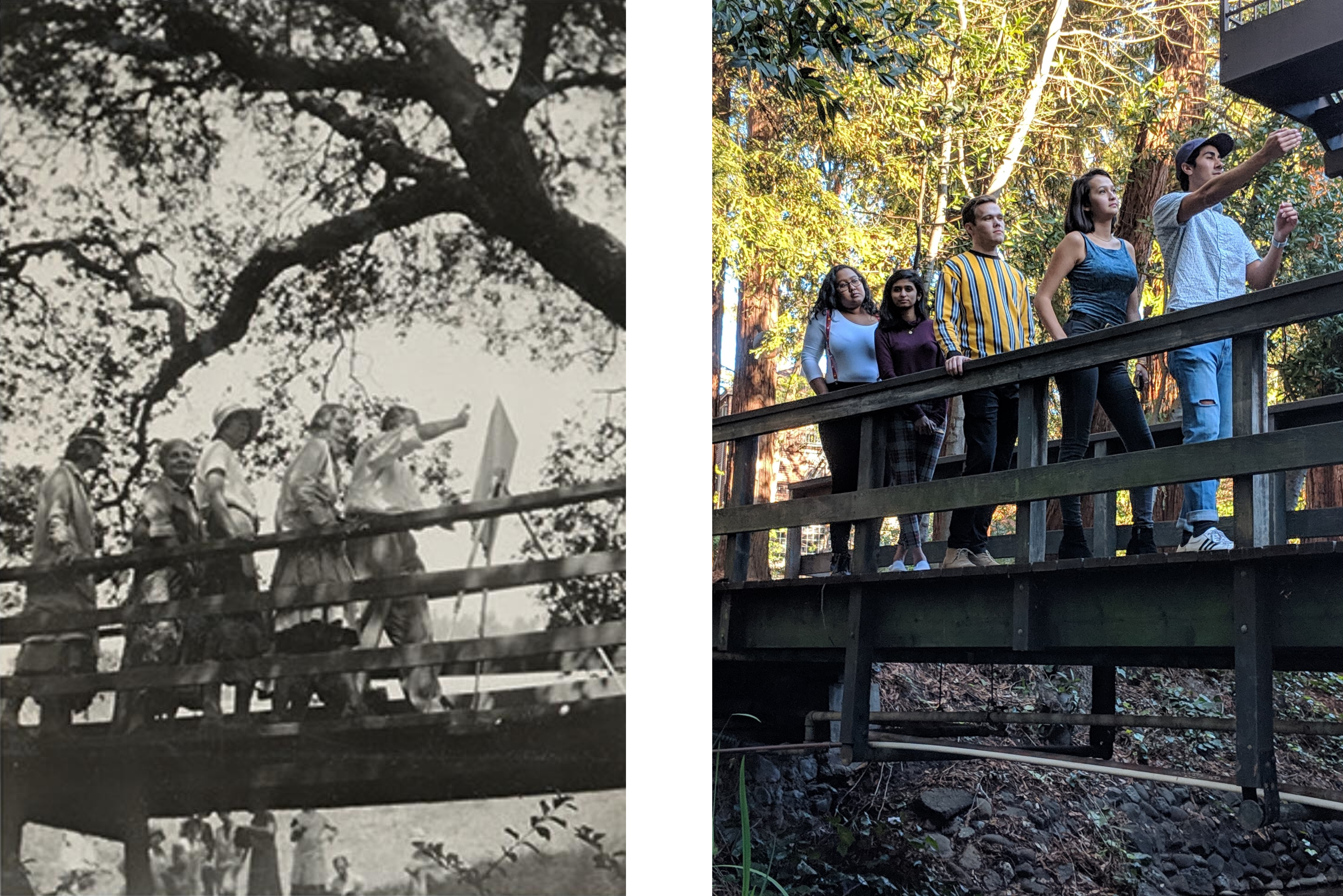
Our team recreating a picture taken of Hans Hofmann teaching a class at Berkeley.
