
Project Lead

Outreach & Design

Outreach & Research

Design & Research

Design & Research

Design & Research

Maker Education Service Lead

Head of Instruction Services Division
As creative communities and individuals become increasingly valued in an age of innovation, we feel the need to support environments that foster creativity and the users of those spaces. For many of us, the Moffitt Makerspace is positioned as an invaluable resource for all communities on campus to explore the infinite opportunities of innovation. Thus, we targeted the broad action items of rebranding, maximizing awareness, expanding current user groups, and redesigning for spatial efficiency.
UC Berkeley’s Moffitt Library Makerspace was established in 2016 by the Student Technology Fund and the b. Makerspace student design club. Its main purpose is to provide core makerspace activities at the lowest entry-level possible. The Moffitt Makerspace currently offers free workshops and access to 3D printer, vinyl cutters, button makers, and hand-operated tools
Annalise and Nicole had approached Invention Corps hoping to find ways to understand and expand the makerspace’s user group as well as prepare user research for the Center for Connected Learning renovation. After initial observations, our team felt that the Moffitt Makerspace, as a resourceful space on campus, lacked a clear identity and presence at Cal.

UC Berkeley students, staff, and campus organizations


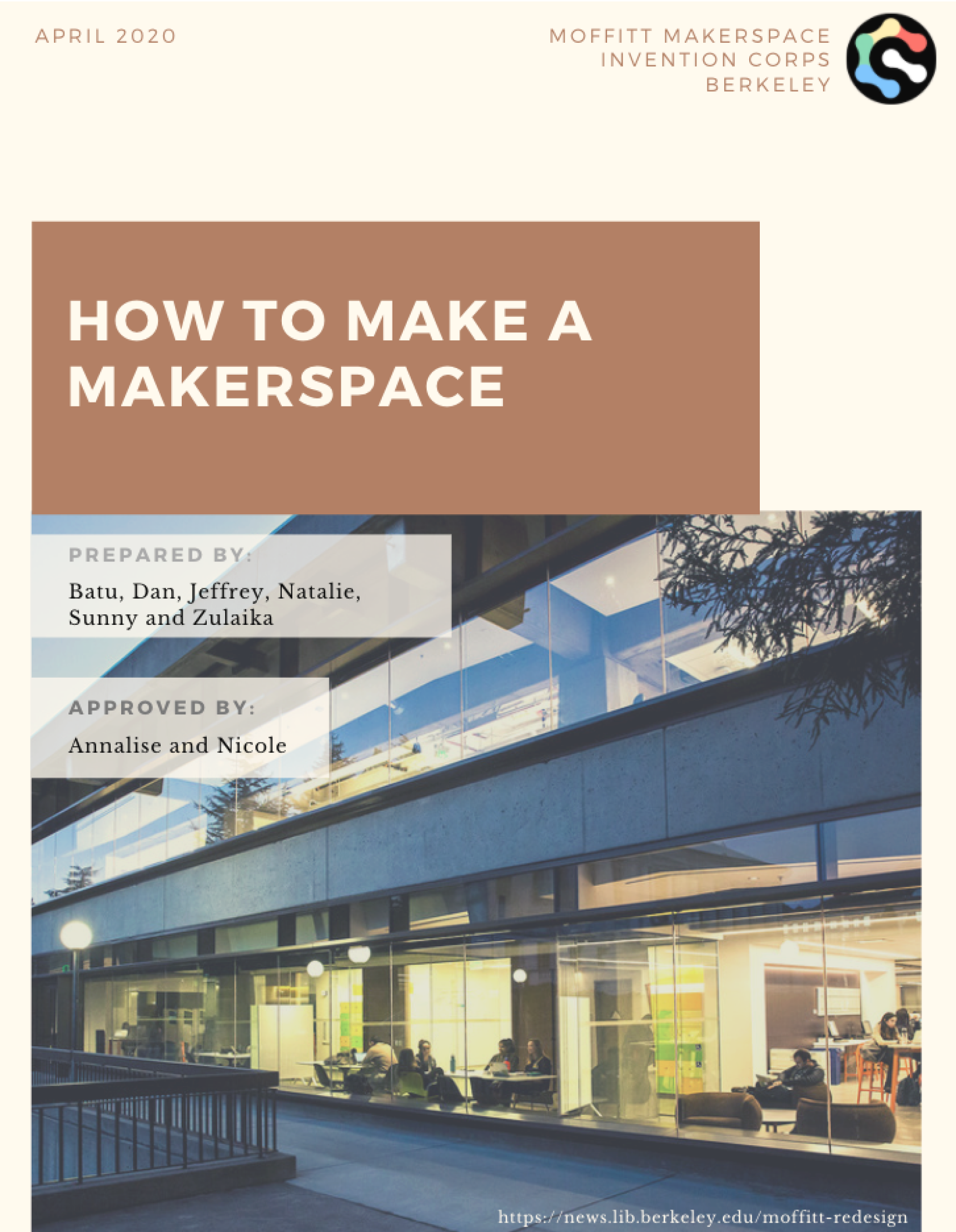
Our solution to the problem is an all-comprehensive Makerspace Guide that includes marketing strategies, user-interview templates and research, and design assets for future iterations of the Moffitt Makerspace.


Given the current COVID-19 pandemic, we have readjusted those goals to create a guide tailored to the specific needs of the MM: lack of awareness, lack of engagement in the space, and lack of control over the space.
Futhermore, the Moffitt Makerspace is positioned within the larger renovation of Moffitt Library’s 1st to 3rd floors soon to be know as the Center for Connected Learning. Thus, we have shaped our guide and research to be useful in the long-term structural and systematic redesign.
Our guide includes various user interview guides, design suggestions and assets, and marketing strategies and resources. Our specific focus on outreach efforts include email templates and recommended student groups to reach out to. We saw cross-campus partnership as an effective and sustainable way to continue expanding the current user groups. Recommended organizations include freshmen and transfer orientations as well as student residence hall associations. You can see our full guide here.


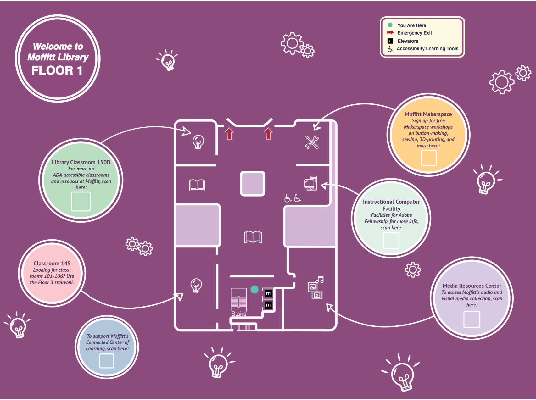
The final wall map for Moffitt Floor 1 includes several key features that create better transparency for the
functionality of each room (see image to the left).
The first key feature is the informational bubbles to each space describing the room’s functionality with interactive
QR-codes for additional information.
The second key feature is the design aesthetic for the wall-sized map. The muted purple reflects the actual color of the wall and is complimented by pastels for a simple, easily digestible info-graphic.


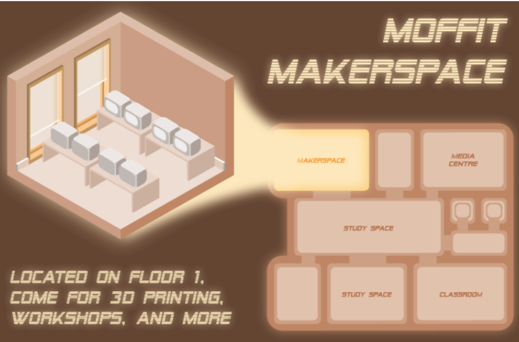
Our final deliverable is a postcard-sized pamphlet that promotes and brings awareness to the space and is to be handed out at the numerous front-desks of Moffitt Library as well as other makerspaces around campus. The pamphlet features both a 2D layout map of the first floor of Moffitt as well as a 3D orthographic depiction of the makerspace. The pamphlets also include a brief overview of the features, location, and hours of the makerspace.
Parallel to the design aesthics of the wall map and the Moffitt Makerspace Guide, the pamphlet follows muted, warm tan, and brown colors to convey a feeling described by the team as “cozy-library-vibes.”
