
Project Lead, UI Designer

Illustrator

Developer

Chief Executive Officer

Chief Marketing Officer
We worked on the redesign and redevelopment of a website for the company SyGlass. This website is a platform to showcase their VR scientific microscopy product. Our role was to create a website which conveys the innovation and excitement of using VR technology for scientific discovery.
SyGlass is a start-up company that produces VR for scientific microscopy. Their mission is to improve the data visualization process for scientific research by elevating data viewing to a 3 and even 4D experience. With a growing client base, SyGlass's product helps scientists rediscover their own data, while also providing a platform to better communicate and even teach their findings. environmental planning.
Despite being highly trusted and valued among current clients, SyGlass's credibility and innovative technology is not fully reflected by their current website. The current website offers abundant resources to learn more about SyGlass, how to use their product, and even access to free datasets, but the way they are organized is difficult to navigate. Their narrative is not clearly depicted by their site, missing out on an opportunity to showcase all of their visuals . SyGlass is also currently actively searching and reaching out to potential clients. A redesigned website with more traffic would hopefully aid this process and attract additional clients.

Who are in the process of publishing papers or educators looking to present their work.


We created prototypes re-imagining syGlass’ current website and built a new platform with the aid of exisitng templates based on our design. Once the new website is launched, it will showcase the SyGlass product and its potential in a more visual and user friendly way, serving both as a pitch-deck and guide for the syGlass software.


In order to fully immerse ourselves in the syGlass VR software, our mentors lent us a computer and oculus to explore their product.
Since our team is spread out across different time zones, we started our project by independently reviewing Syglass’ current website and documenting potential areas of improvement.
After this, we met with our mentor to discuss prospective implementation of our proposed changes and prioritized the following elements.


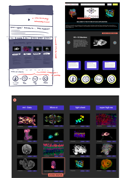
A high priority was creating a landingpage that is eye-catching and features examples of the VR data. We decided to restructure the page by centering the logo, images and reducing the amount of text.
We also wanted to include a gallery view that would better showcase the data sets available. Before, the data was arranged in a textual grid table. A tile gallery makes it easier for visitors to browse existing data and to envision their research being viewed through SyGlass.
Our process of redesigning followed the path of collaboratively annotating the existing website, then creating a low-fidelity protoype to envision the new landing page. From there we created a more detailed wireframe using actual syGlass visuals and text. This then served as a framework for the website redevelopment.


After communicating with the Syglass team, we received a breakdown of their data path process and what they felt were critical stages in the SyGlass to client process.
1) Microscope Acquisition Software
2) Syglass VR experience
3) Publishing the paper
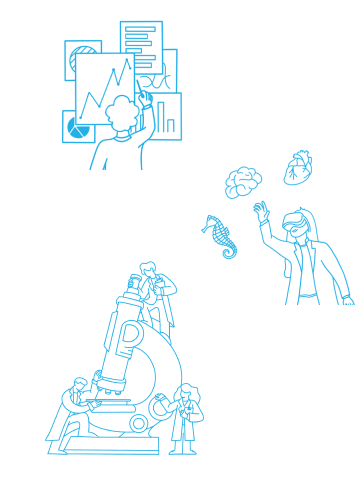
Following this, we brainstormed some concepts for the illustrations and visualized them as lo-fi sketches. Through our illustrations, we aimed to emphasize the interactivity of the entire process and give the website an edge.
After testing out various different coloring techniques, we decided that a clean mono-lined look would integrate most smoothly with the simplicity of the website.


SyGlass suggested we use a website template as our basis for the website re-design. So we collectively chose a template called Aeroland.
No member from the ICB team had prior experience with developing websites, so our mentor, Michael, set up an introductory meeting where he guided us through the first steps.
We continued by sourcing components such as the gallery view, or buttons from the template libary that best matched our FIGMA wireframe.
We then transfered images, arranged composition, experimented with layout and styles.
Since this step involved coding, we worked closely with our mentor learning how to code in JavaScript and Vue, as we built the website. We coded collaboratively and exchanged feedback on the website incrementally. This part of the project is still in progress.

We look forward to finalizing the website for syGlass to ultimately launch it. Once they transition from their current website to the redesigned version, we hope it will help potential customers to better understand and immerse themselves in the syGlass product and ultimately choose to work with the startup for their research.